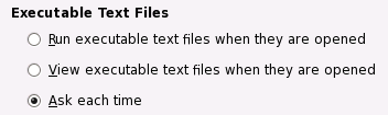
Radio Buttons
Radio buttons are used in groups to select from a mutually exclusive set of options. Only one radio button within a group may be set at any one time. As with check boxes, do not use radio buttons to initiate actions.
-
Only use radio buttons in groups of at least two, never use a single radio button on its own. To represent a single setting, use a check box or two radio buttons, one for each state.
-
Exactly one radio button should be set in the group at all times. The only exception is when the group is showing the properties of a multiple selection, when one or more of the buttons may be in their mixed state.
-
Do not initiate an action when the user clicks a radio button. However, if used in an instant-apply property or preference window, update the setting represented by the radio button immediately.
-
Clicking a radio button should not affect the values of any other controls. It may sensitize, insensitize, hide or show other controls, however.
-
If toggling a radio button affects the sensitivity of other controls, place the radio button immediately to the left of the controls that it affects. This helps to indicate that the controls are dependent on the state of the radio button.
-
Use sentence capitalization for radio button labels, for example Switched movement. Provide an access key in the label that allows the user to set the radio button directly from the keyboard.
-
If the radio button represents a setting in a multiple selection that is set for some objects in the selection and unset for others, show the radio button in its mixed state. For example:
Figure 6-14 Radio buttons (right) showing properties for a multiple selection of shapes in a drawing application (left)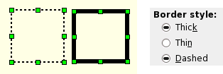
. In this situation, clicking any radio button in the group should set the clicked button, and unset all the others. Thereafter, the group should behave like a normal radio button group— there is no way to reset a radio button to its mixed state by clicking on it. Provide a button or equivalent in the window that allows the previous mixed settings to be restored without closing the window or cancelling the dialog.
-
Label a group of radio buttons with a descriptive heading above or to the left of the group.
-
Use a frame around the group if necessary, but remember that blank space often works just as well and results in a less visually-cluttered dialog.
-
Do not place more than about eight radio buttons under the same group heading. If you need more than eight, consider using a single-selection list instead— but you probably also need to think about how to simplify your user interface.
-
Try to align groups of radio buttons vertically rather than horizontally, as this makes them easier to scan visually. Use horizontal or rectangular alignments only if they greatly improve the layout of the window.