Lists
A list control allows the user to inspect, manipulate or select from a list of items. Lists may have one or more columns, and contain text, graphics, simple controls, or a combination of all three.
-
Always give list controls a label, positioned above or to the left of the list, in sentence capitalization. Provide an access key in the label that allows the user to give focus directly to the list.
-
Make the list control large enough that it can show at least four items at a time without scrolling. For lists of ten or more items, increase this minimum size as appropriate.
-
If the list appears in a dialog or utility window, consider making the window and the list within it resizable so that the user can choose how many list items are visible at a time without scrolling. Each time the user opens this dialog, set its dimensions to those that the user last resized it to.
-
Do not use lists with less than about five items, unless the number of items may increase over time. Use check boxes, radio buttons or an drop-down list if there are fewer items.
-
Only use column headers when:
- the list has more than one column, or
- the list has only one column, but the user may wish to re-order the list. (This is rarely useful with single column lists).
In most other situations, column headers take up unnecessary space, and the extra label adds visual clutter.
-
Always label column headers when used. If the column is too narrow for a sensible label, provide a tooltip for the column instead. Apart from its obvious use, this will help ensure that assistive technologies can describe the use of the column to visually impaired users.
-
Consider using a check box list for multiple-selection lists, as these make it more obvious that multiple selection is possible:
Figure 6-20 A simple check box list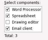
If you do this, you should normally set the list control itself to be single-selection, but this depends on the particular task for which it will be used.
-
For multiple selection lists, show the number of items currently selected in a static text label below the list, for example, Names selected: 3. Such a label also makes it more obvious that multiple selection is possible.
-
Consider providing and buttons beside multiple selection lists, if appropriate.
- 6.14.1. Sortable Lists
6.14.1. Sortable Lists
Users often prefer to sort long lists, either alphabetically or numerically, to make it easier to find items. Allow users to sort long or multi-column lists by clicking on the column header they want to sort.
-
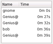
Indicate which column is currently sorted by showing an upward or downward facing arrow in its header:
Sort Order Arrow Direction Example Natural Down Alphabetical; smallest number first; earliest date first; checked items first Reverse Up Reverse alphabetical; largest number first; most recent date first; unchecked items first) Clicking an unsorted column header sorts the column in natural order, indicated by showing a down arrow in its header.
-
Clicking a column header sorted in natural order re-sorts it in reverse order, indicated by showing an up arrow in its header.
Un-sorting listsOccasionally, an unsorted state may be useful, for example to show items in the order in which the user added them to the list. In such cases, clicking a column sorted in reverse order should un-sort it, indicated by removing the arrow from the column header.
Usually, however, this is better achieved by adding an extra column that the user can sort in the usual way, such as a sequence number column in this example.