Tabbed Notebooks
A tabbed notebook control is a convenient way of presenting related information in the same window, without having to display it all at the same time. It is analagous to the divider tabs in a ring binder or a file cabinet.
-
Do not put too many pages in the same notebook. If you cannot see all the tabs without scrolling or splitting them into multiple rows, you are probably using too many and should use a list control instead. See the example below.
-
Label tabs with header capitalization, and use nouns rather than verbs, for example Font or Alignment. Try to keep all labels in a notebook the same general length.
-
Do not assign access keys to tab labels, as this means you cannot use those access keys for any other control on any of the notebook pages without conflict. Even if you are able to assign access keys that would not conflict, it is better not to as it may be impossible to avoid the conflict when your application is translated to other languages. Assign an access key to every other control on each page, however.
-
Do not design a notebook such that changing controls on one page affects the controls on any other page. Users are unlikely to discover such dependencies.
-
If a control affects only one notebook page, place it on that notebook page. If it affects every page in the notebook, place it outside the notebook control, for example beside the window's and buttons.
-
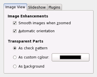
Use tabs that are proportional to the width of their labels. Don't just set all the tabs to the same width, as this makes them harder to scan visually, and limits the number of tabs you can fit into the notebook without scrolling. For example:
Figure 6-24 Fixed- and proportional-width tabs (preferred)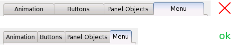
-
Although the contents of each page in a notebook will take up a different amount of space, do not use larger than normal spacing around the controls in the "emptier" pages, and do not center the controls on the page.
-
If your tab labels include icons, choose whether or not to show the icons at runtime based on the user's preference in the GNOME Menus and Toolbars desktop preferences dialog. Always show the text part of the label, however.
If you have more than about six tabs in a notebook, use a list control instead of tabs to switch between the pages of controls. For example:
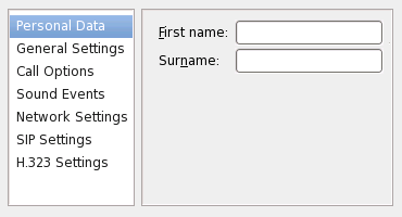
As in this example, place the list control on the left-hand side of the window, with the dynamic portion of the window immediately to its right.
- 6.16.1. Status Indicators
6.16.1. Status Indicators
In some tabbed windows, such as preference windows, it might be desirable to indicate the status of a particular tab. This can be used to notify the user that a web page that is still loading or has been loaded, a new message is waiting in a particular instant messasing conversation, or that a document has not been saved. Such a status indicator should be an icon that is placed directly to the left of the tab label. Additionally, the tab label's color might be changed to indicate a certain status. Do not simply rely on a different coloring scheme for status indication.