Buttons
A button initiates an action when the user clicks it.
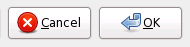
Figure 6-9 Typical buttons in a modal dialog
Guidelines
- Label all buttons with imperative verbs, using header capitalization. For example, Save, Sort or Update Now. Provide an access key in the label that allows the user to directly activate the button from the keyboard.
- After pressing a button, the user should expect to see the result of their action within 1 second. For example, closing the window or opening another. See Chapter 7 ― Feedback for guidance on what to do if your application cannot respond this quickly.
- Use an ellipsis (...) at the end of the label if the action requires further input from the user before it can be carried out. For example, Save As... or Find.... Do not add an ellipsis to commands like Properties, Preferences, or Settings, as these open windows that do not require further input.
- Once a dialog is displayed, do not change its default button from one button to another. You may add or remove default status from the same button if it helps prevent user error, however. Changing the default from one button to another can be confusing and inefficent, especially for users relying on assistive technologies.
- If your button can display text, an icon, or both, choose which label to display at runtime according to the user's preference in the GNOME Menus and Toolbars Preferences dialog. However, you may over-ride this preference when there is no suitable icon to describe the button's action graphically, for example.
- Do not use more than one or two different widths of button in the same window, and make all of them the same height. This will help give a pleasing uniform visual appearance to your window that makes it easier to use.
- Do not assign actions to double-clicking or right-clicking a button. Users are unlikely to discover these actions, and if they do, it will distort their expectations of other buttons on the desktop.
- Make invalid buttons insensitive, rather than popping up an error message when the user clicks them.
In a dialog, one button may be made the default button, which is shown with a different border and is activated by pressing Return. Often this will be the or equivalent button. However, if pressing this button by mistake could cause a loss of data, do not set a default button for the window. Do not make the default button instead. See Section 3.3.3 ― Default Buttons for more information.
If it does not make sense to have a default button until several fields in the dialog have been correctly completed—for example, both the Username and Password fields in a login dialog—do not set the default button until they have both been completed.