Drop-down Lists
Drop-down lists are used to select from a mutually exclusive set of options. They can be useful when there is insufficient space in a window to use a group of radio buttons or a single-selection list, with which they are functionally equivalent.
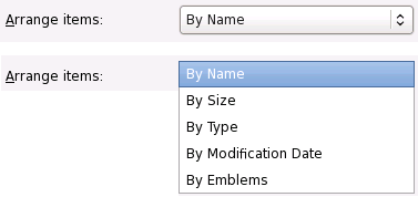
Figure 6-17 A drop-down list showing current selection (left) and the list of
available choices when clicked on (right)
Recommendations:
- Do not use drop-down lists with fewer than three items, or more than about ten. To offer a choice of two options, use radio buttons or toggle buttons. To offer a choice of more than ten options, use a list.
- Do not initiate an action when the user selects an item from an drop-down list. However, if used in an instant-apply property or preference window, update the setting that the menu represents immediately.
- Selecting an item from a drop-down list should not affect the values of any other controls. It may sensitize, insensitize, hide or show other controls, however.
- Label the drop-down list with a text label above it or to its left, using sentence capitalization. Provide an access key in the label that allows the user to give focus directly to the drop-down list.
- Use sentence capitalization for drop-down list items, for example Switched movement
- Assign an access key to every drop-down list item. Ensure each access key is unique within the enclosing window or dialog, not just within the menu.
- Do not assign shortcut keys to drop-down list items by default. The user may assign their own shortcut keys in the usual way if they wish, however.
- Do not use a drop-down list in a situation where it may have to show a property of a multiple selection, as drop-down lists have no concept of mixed state. Use a group of radio or toggle buttons instead, as these can show set, unset or mixed states.
- Do not use submenus on a drop-down list.
You should normally use radio buttons or a list instead of drop-down lists, as those controls present all the available options at once without any further interaction. However, drop-down lists may be preferable in a window where:
- there is little available space
- the list of options may change over time
- the contents of the hidden part of the menu are obvious from its label and the one selected item. For example, if you have an option menu labelled "Month:" with the item "January" selected, the user might reasonably infer that the menu contains the 12 months of the year without having to look.
Drop-down lists can also be useful on toolbars, to replace a group of several mutually-exclusive toggle buttons.