Text Labels
To a user with normal vision, textual output provides the majority of the information and feedback in most applications. To a visually-impaired user who may not be able to see or understand any additional graphical output, clear textual output is critical. You must therefore choose and position text carefully on the screen, and leave the choice of fonts and sizes to the user, to ensure that all users are able to use your application effectively.
- 8.3.1. Spacing and Alignment
- 8.3.2. Capitalization
8.3.1. Spacing and Alignment
Use spacing and alignment of text uniformly throughout your application. A basic rule of thumb is to put space between user interface components in increments of 6 pixels, going up as the relationship between related elements becomes more distant.
| Element | Placement | Example |
|---|---|---|
| Large Icons (file browser) | Horizontally centered with and (6 pixels, if specification necessary)below large icon |
 |
| Small icons (toolbar) | Vertically centered with and (6 pixels, if specification necessary) to the right of small icons |
 |
| List control label | 6 pixels above and horizontally left aligned with list control or 12 pixels to the left of and horizontally top aligned with list control |
 |
| Radio button and check box labels | 6 pixels to the right of and vertically center aligned with radio button |
 |
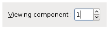
| Text field labels | 6 pixels to the left of and vertically center aligned with textfield control |
 |
| Button labels | 12 pixels of padding to either side of centered text (and any accompanying graphic). If appearing in a group of buttons, longest button label sets button size, center all other button labels and accompanying graphics in same-sized buttons |
 |
| Other component labels (e.g., spin boxes, text fields | 12 pixels between the longest text label and its associated component, all other text labels in component grouping left aligned with the longest label. All labels vertically center aligned with associated components |
 |
- If the label precedes the control it is labelling, end the label with a colon. For example, Email: to label a text field into which the user should type their email address. This helps identify it as a control's label rather than an independent item of text. Some assistive technology screen review utilities may also use the presence of a colon to identify text as a control label.
- Ensure that a label with a mnemonic is associated with the control it labels.
- Left-align components and labels, unless all the labels in a group have very different lengths. If they do, right-align the labels instead, to ensure that no controls end up too far away from their corresponding labels.
- Choose label names carefully. Label objects with names that make sense when taken out of context. Users relying on screenreaders or similar assistive technologies will not always be able to immediately understand the relationship between a control and those surrounding it.
- Be consistent with label usage and semantics. For example, if you use the same label in different windows, it will help if it means the same thing in both windows. Equally, don't use labels that are spelled differently but sound the same, e.g., "Read" and "Red", as this could be confusing for users relying on screenreaders.
- Don't use the same label more than once in the same window. This makes life difficult for users relying on tools like magnifiers or screen readers, which cannot always convey surrounding context to the user.
- Do not hard-code font styles and sizes. The user should be able to adjust all sizes and typefaces.
- Do not use more than two or three different fonts and sizes in your application, and choose visually distinct rather than similar-looking fonts in one window. Too many font sizes and styles will make the interface look cluttered and unprofessional, and be harder to read. In general, always use fonts from the current theme, and specify relative rather than absolute sizes.
- Do not use graphical backdrops or "watermarks" behind text, other than those specified by the user's chosen theme. These interfere with the contrast between the text and its background. This can cause difficulty for users with visual impairments, who will therefore normally choose themes that always use plain backdrops.
8.3.2. Capitalization
Two styles of capitalization are used in GNOME user interface elements:
- Header capitalization
-
Capitalize all words in the element, with the following exceptions:
- Articles: a, an, the.
- Conjunctions: and, but, for, not, so, yet ...
- Prepositions of three or fewer letters: at, for, by, in, to ...
- Sentence capitalization
-
Capitalize the first letter of the first word, and any other words normally capitalized in sentences, such as application names.
The following table indicates the capitalization style to use for each type of user interface element.
| Element | Style |
|---|---|
| Check box labels | Sentence |
| Command button labels | Header |
| Column heading labels | Header |
| Desktop background object labels | Header |
| Dialog messages | Sentence |
| Drop-down combination box labels | Sentence |
| Drop-down list box labels | Sentence |
| Field labels | Sentence |
| Filenames | Sentence |
| Graphic equivalent text: for example, Alt text on web pages | Sentence |
| Group box or frame labels | Header |
| Items in drop-down combination boxes, drop-down list boxes, and list boxes | Sentence |
| List box labels | Sentence |
| Menu items | Header |
| Menu items in applications | Header |
| Menu titles in applications | Header |
| Radio button labels | Sentence |
| Slider labels | Sentence |
| Spin box labels | Sentence |
| Tabbed section titles | Header |
| Text box labels | Sentence |
| Titlebar labels | Header |
| Toolbar button labels | Header |
| Tooltips | Sentence |
| Webpage titles and navigational elements | Header |
Languages other than English may have different rules about capitalization. For example, Swedish has no concept of Header capitalization. Contact the GNOME Translation Project if you are in doubt about how to capitalize labels in a particular language.