Toggle Buttons
Toggle buttons look similar to regular Buttons, but are used to show or change a state rather than initiate an action. A toggle button's two states, set and unset, are shown by its appearing "pushed in" or "popped out" respectively.
-
Do not use groups of toggle buttons in dialogs unless space constraints force you to do so, or you need to provide consistency with a toolbar in your application. Check boxes or radio buttons are usually preferable, as they allow more descriptive labels and are less easily-confused with other types of control.
-
Only use toggle buttons in groups, so they are not mistaken for regular buttons. Make the group behave like either a group of check boxes or a group of radio buttons, as required.
-
Provide an access key in the label of all toggle buttons that allows the user to set or unset the button directly from the keyboard.
-
Label a group of toggle buttons with a descriptive heading above or to the left of the group, as you would with a group of check boxes or radio buttons.
-
Use a frame around the group of buttons if necessary, but remember that blank space often works just as well and results in a less visually-cluttered dialog.
-
Try to align groups of toggle buttons horizontally rather than vertically. This is how toggle buttons normally appear on a toolbar, so the user will be more familiar with this arrangement.
-
Do not leave any space between toggle buttons in a group, otherwise they may look unrelated or may be mistaken for regular buttons.
-
Use header capitalization for toggle button labels, for example , .
-
If your toggle button can display text, an icon, or both, choose which to display at runtime according to the user's setting in the GNOME Menus and Toolbars preference dialog.
-
Use the same text or graphical label for a toggle button whether it is set or unset.
-
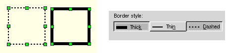
If the toggle button represents a setting in a multiple selection that is set for some objects in the selection and unset for others, show the button in its mixed state. For example:
Figure 6-16 Toggle buttons (right) showing properties for a multiple selection of shapes in a drawing application (left)