Utility Windows
Utility windows, such as palettes and toolboxes, normally have borders. They do not contain a menu bar, a toolbar, or a statusbar.
A utility window should not appear in the panel window list unless it is, or may be, the only window shown by an application. Otherwise, the utility window should be raised above the application when the application window itself is selected from the window list.
- 3.3.1. Instant apply windows
- 3.3.2. Explicit apply windows
- 3.3.3. Default Buttons
- 3.3.4. Property Windows
- 3.3.5. Preferences Windows
- 3.3.6. Toolboxes
3.3.1. Instant apply windows
For windows that allow the user to change values or settings, such as property and preference windows, update those values or settings immediately to reflect the changes made in the window. This is known as "instant apply". Do not make the user press an or button to make the changes happen, unless either:
- the change will take more than about one second to apply, in which case applying the change immediately could make the system feel slow or unresponsive, or
- the changes in the window have to be applied simultaneously to prevent the system entering a potentially unstable state. For example, the hostname and proxy fields in a network properties window.
If either these conditions affect only a few of the controls in your window, arrange those controls together into one or more groups, each with its own button. Leave the rest of the controls as instant apply.
- Do not attempt to validate or apply changes caused by editing a text field control until the user has moved focus to a different control in the window, or the window is closed. Validating after each keypress is usually annoying and unnecessary. Exception: if the field accepts only a fixed number of characters, such as a hexadecimal color code, validate and apply the change as soon as that number of characters have been entered.
- When the user moves focus to a different control, do not indicate an invalid entry by displaying an alert or undoing the change the user made. Both of these methods are particularly disruptive for focus-follows-mouse users, for whom focus may leave the control more often than it does for a click-to-focus user.
3.3.2. Explicit apply windows
If most of the controls in your window are not suitable for instant apply, consider making the whole window "explicit apply". An explicit apply window has these three buttons in its button box, plus an optional button:
-
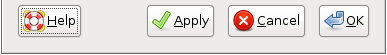
Apply
Applies all the settings in the window, but does not close the window in case the user wishes to change their mind.
-
Cancel
Resets all settings in the window to those that were in force when the window was opened. Note: this must undo the effects of all applications of the since the window was opened, not just the most recent one.
-
OK
Applies all settings in the window, and closes the window.
3.3.3. Default Buttons
When designing a dialog or utility window, you can assign the Return key to activate a particular button in the window. GNOME indicates this button to the user by drawing a different border around it. For example, the button in Figure 3-5.
Choose the default button to be the most likely action, such as a confirmation action or an action that applies changes in a utility window. Do not make a button the default if its action is irreversible, destructive or otherwise inconvenient to the user. If there is no appropriate button in your window, to designate as the default button, do not set one.
In particular, it is currently not recommended to make the button the default in an instant apply window, as this can lead to users closing the window accidentally before they have finished using it.
3.3.4. Property Windows
Property windows allow the user to view and change the characteristics of an object such as a document, file, drawing, or application launcher.
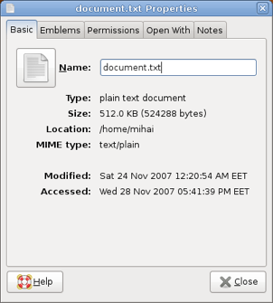
Object Name Properties
Close, Minimize, Roll-up/Unroll
Place a button in the lower right corner. A may be placed in the lower left corner.
3.3.5. Preferences Windows
Preferences windows allow the user to change the way an application looks or behaves.
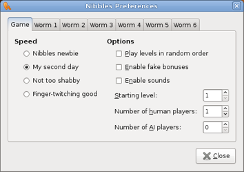
Application Name Preferences
Close, Minimize, Roll-up/Unroll
Place a button in the lower right corner. A may be placed in the lower left corner.
- 3.3.5.1. Customizing Fonts and Colors
3.3.5.1. Customizing Fonts and Colors
If your preferences window allows the user to customize fonts or colors, use the following wording and layout as a guide for these controls:
	(o) Use font from theme
	(o) Use this font: [ Font selector ]

	(o) Use colors from theme
	(o) Use these colors:
		Background: [ color selector ]
		Foreground: [ color selector ]
The wording of the radio buttons may be more specific where required, for example, "Use monospace font from theme", or "Use background color from theme".
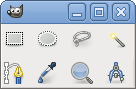
3.3.6. Toolboxes
A toolbox provides convenient access to a set of actions and toggles through a set of small toolbar-like buttons. Toolboxes can be used to provide a specialized group of tools to augment a toolbar containing more universal items such as and . A single toolbox can be shared between multiple documents to save screen space.
Toolboxes have no title
Close, Roll-up/Unroll
Toolboxes have no buttons
Make toolboxes resizable, but only resize by discrete toolbox item widths. In other words, the user can resize the toolbox to be one item wide, two items wide, three items wide, etc. but not one and a half items wide.
- Only place buttons in a toolbox that do not open another window.
- Toolboxes are best used for modal toggle buttons that affect the operation of the mouse on the document, such as a set of buttons for choosing between paintbrush, eraser, and fill modes in a drawing application. Buttons that initiate actions upon clicking (such as a save button) are better placed in toolbars.
- Ensure that closing a toolbox does not close or otherwise alter any primary window with which it is associated.
- Do not place toolboxes in the system window list. Toolboxes should always remain above all primary windows with which they are associated.
- If all primary windows associated with a toolbox are closed or minimized, hide the toolbox as well. Show the toolbox again when one of the primary windows is opened or restored.
- Make a toolbox two items wide by default, unless it is broken into categories. Make categorized toolboxes four items wide by default.
- 3.3.6.1. Toolbox Categories
3.3.6.1. Toolbox Categories
While categories may not be as visually appealing as a toolbox homogenously filled with beautiful icons, they make an unwieldy large toolbox more managable. Picking a small icon from more than fifteen other items is a difficult task. Additionally, categories allow users to hide sets of tool items that are not relevant to their current task.
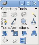
- Break toolboxes with more than sixteen items into categories. The best size for a category is between four and ten items.
- Give each category a label (in title caps) and a collapsing arrow. Clicking the label or the arrow toggles the category between a collapsed and uncollapsed state.