Check Boxes
Check boxes are used to show or change a setting. Its two states, set and unset, are shown by the presence or absence of a checkmark in the labelled box.
-
Do not initiate an action when the user clicks a check box. However, if used in an instant-apply property or preference window, update the setting represented by the check box immediately.
-
Clicking a check box should not affect the values of any other controls. It may sensitize, insensitize, hide or show other controls, however.
-
If toggling a check box affects the sensitivity of other controls, place the check box immediately above or to the left of the controls that it affects. This helps to indicate that the controls are dependent on the state of the check box.
-
Use sentence capitalization for check box labels, for example Use custom font.
-
Label check boxes to clearly indicate the effects of both their checked and unchecked states, for example, Show icons in menus. Where this proves difficult, consider using two radio buttons instead so both states can be given labels. For example:
Figure 6-11 Ambiguous check box (top), radio buttons work better in this case (bottom)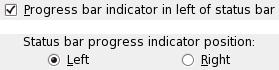
The single check box in this example is ambiguous, as it is not clear where the "progress indicator" will go if the box is unchecked. Two radio buttons are better in this case, as they make the options clear.
-
Provide an access key in all check box labels that allows the user to set or unset the check box directly from the keyboard.
-
If the check box represents a setting in a multiple selection that is set for some objects in the selection and unset for others, show the check box in its mixed state. For example:
Figure 6-12 Check boxes (right) showing properties for a multiple selection of files in Nautilus (left)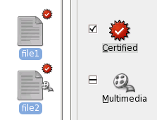
In this example, both selected files are hidden (since their filenames start with "."), and the emblems on their icons show that neither file is writeable, but one is readable. The Readable check box is therefore shown in its mixed state. .
When a check box is in its mixed state:
- clicking the box once should check the box, applying that setting (when confirmed) to all the selected objects
- clicking the box a second time should uncheck the box, removing that setting (when confirmed) to all the selected objects
- clicking the box a third time should return the box to its mixed state, restoring each selected object's original value for that setting (when confirmed)
-
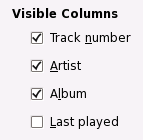
Label a group of check boxes with a descriptive heading above or to the left of the group.
-
Use a frame around the group if necessary, but remember that blank space often works just as well and results in a less visually-cluttered dialog.
-
Do not place more than about eight check boxes under the same group heading. If you need more than eight, try to use blank space, heading labels or frames to divide them into smaller groups. Otherwise, consider using a check box list instead— but you probably also need to think about how to simplify your user interface.
-
Try to align groups of check boxes vertically rather than horizontally, as this makes them easier to scan visually. Use horizontal or rectangular alignments only if they greatly improve the layout of the window.