Dialogs
A dialog provides an exchange of information, or dialog, between the user and the application. Use a dialog to obtain additional information from the user that is needed to carry out a particular command or task.
A dialog should not appear in the panel window list. Any open dialogs should be raised above the application when the application window itself is selected from the window list.
Name of command that opened the dialog (without any trailing ellipsis)
Minimize, Roll-up/Unroll
Follow the guidelines for Alert buttons, see Section 3.4.2 ― Alert Buttons.
Your dialog may specify a default button, that is activated when the user presses the Return key. See Section 3.3.3 ― Default Buttons for guidance on choosing an appropriate default button.
- 3.6.1. Additional Buttons
- 3.6.2. Layout
- 3.6.3. Common Dialogs
3.6.1. Additional Buttons
You can include other buttons in a dialog's main button area in addition to the affirmative button and , but any more than one or two such buttons will make the dialog appear complicated and difficult to use. As with any other button, keep the labels as concise as possible to minimize this effect.
- Place buttons that apply to the dialog as a whole in the main button area row at the bottom of the dialog, to the left of the button.
- Place buttons that apply to one or a few controls next to their associated controls. For instance, place a button at the trailing edge of the text field it fills in.
3.6.2. Layout
A clean, logical dialog layout helps the user to quickly understand what information is required from them.
- Arrange controls in your dialog in the direction that people read. In western locales, this is generally left-to-right, top-to-bottom. Position the main controls with which the user will interact as close to the upper left corner as possible. Follow similar guidelines for arranging controls within groups in the dialog, and for specifying the order in which controls are traversed using the Tab key.
- When opening a dialog, provide initial keyboard focus to the component that you expect users to operate first. This focus is especially important for users who must use a keyboard to navigate your application.
- Provide and show sensible default values for as many of the controls in your dialog as possible when it is opened, so the user does not have to generate the information from scratch. These defaults may come from system settings (for example, hostname or IP address), or from information that the user has previously entered in this or another application (for example, email address or network proxy).
See Chapter 8 ― Visual Design for more detailed information on arranging controls in dialogs.
See Section 6.16 ― Tabbed Notebooks for information on using tabbed notebook controls in dialogs.
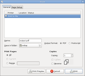
3.6.3. Common Dialogs
The gtk and GNOME libraries provide standard dialogs for many common tasks, including opening and saving files, choosing fonts and colors, and printing. Always use these when the user is performing one of these tasks. You may modify the dialogs to reflect the needs of your particular application (for example, adding preview and buttons to the Open File dialog in an audio application), but do not change or remove features so much as to make them unrecognizable.