Alerts
An alert provides information about the state of the application system, or asks for essential information about how to proceed with a particular task. It is distinct from other types of window in that it is not directly requested by the user, and usually contains a message or a question rather than editable controls. Since alerts are an unwelcome intrusion into the user's work, do not use them except where necessary to avoid potential data loss or other serious problems.
An alert has a border similar to that of a dialog, and is object modal.
An alert should not appear in the panel window list unless it is, or may be, the only window shown by an application. For example, an appointment reminder alert may be shown after the main calendar application window has been closed.
Otherwise, an alert should be raised above the application when the application window itself is selected from the window list.
Alert windows have no titles, as the title would usually unnecessarily duplicate the alert's primary text. This way, users can read and respond to alerts more quickly as there is less visual noise and confounding text.
Alert windows are not resizable. If the user needs to resize your alert, the text is probably not concise enough.
None
Alerts do not appear in the system window list. Consequently, take care to ensure that alerts stay above their parent window. Otherwise, users will be likely to lose the alert and find your application unresponsive for no apparent reason. Modal windows should always stay above the window(s) they block.
- 3.4.1. Alert Text
- 3.4.2. Alert Buttons
- 3.4.3. Spacing and Positioning Inside Alerts
- 3.4.4. Information Alerts
- 3.4.5. Error Alerts
- 3.4.6. Confirmation Alerts
- 3.4.7. Authentication Alerts
3.4.1. Alert Text
An alert may contain both primary and secondary text. The primary text briefly summarizes the situation. The secondary text provides additional information.
Make both the primary and secondary text selectable. This makes it easy for the user to copy and paste the text to another window, such as an email message.
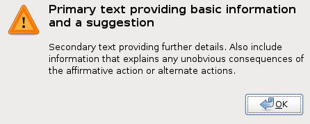
The primary text provides the user with a one sentence summary of the information or suggested action. This summary should concisely contain the essential details of the problem or suggestion. Every alert has primary text, displayed in a bold font slightly larger than the default. The primary text is punctuated in 'newspaper headline' style, that is, it has no terminating period, but it may have a terminating question mark.
Denote primary text with the pango markup:
<span weight="bold"
      size="larger">Primary Text</span>
Secondary text provides a more in-depth description of the problem and suggested action, including possible side effects. Secondary text can also provide information that may be helpful in allowing the user to make an informed decision. In most situations the user should only need the primary text to make a quick decision, but they may read the secondary text if they are unsure of the proper course of action, or require extra details. Secondary text is optional, but if used, place it one text line height beneath the primary text using the default font size and weight.
3.4.2. Alert Buttons
Give all alerts an affirmative button that dismisses the alert and performs the action suggested in the primary text. Provide a button for all alerts displayed in response to a user actions, such as . If the alert warns of a technical problem or other situation that could result in data loss, provide a button that provides more information on the particular situation and explains the user's options. You may also provide buttons to perform alternate actions that provide another possible solution, fix potential problems, or launch related dialogs or programs.
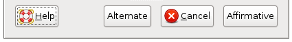
Write button labels as imperative verbs, for example , . This allows users to select an action with less hesitation. An active phrase also fits best with the button's role in initiating actions, as contrasted with a more passive phrase. For example and are better buttons than than and .
-
Affirmative Button
Place the affirmative button in the lower right corner of the alert. The affirmative button accepts the action proposed by the alert, or simply dismisses the alert if no action is suggested (as is the case with an information alert).
-
Cancel Button
If the alert was produced in response to a user action, place a button immediately to the left of the affirmative button. This provides an escape route for users to stop an action in response to new information, or just if they clicked accidentally. Clicking the button reverts the application to its state prior to the user action.
-
Help Button
A button may be used to clarify alerts that present potentially destructive options. Place the button in the lower left corner of the alert. When clicked, launch a help window clarifying the situation, detailing the actions performed by the other buttons, and explaining any side-effects that each action may have.
-
Alternate Buttons
Extra buttons may be used to provide alternates to the primary action proposed by the alert text. Place these buttons to the left of the button, or the affirmative button if is not present. An example of a common alternate action would be a button in a save confirmation alert. This is an alternative to the primary suggested action and the button.
3.4.3. Spacing and Positioning Inside Alerts
Using clear, consistent spacing in alerts makes the message easier to digest and the available responses more obvious.
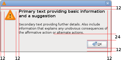
- The border around all edges of the alert, and the space between the icon and the text, is 12 pixels.
- The horizontal spacing between the buttons is 6 pixels.
- Add one line break at the standard font size below both the primary and secondary text, or 24 pixels if you are using Glade.
- Align the top of the icon with the top of the primary text.
- Left-align the message text, for western locales.
Create a new GtkDialog window specifying the number of buttons you wish the alert to contain (and a help button if appropriate). The GtkDialog will contain a GtkVBox with an empty upper row, and a lower row containing a GtkButtonBox with buttons in it. In the empty upper row, place a new GtkHBox. In the left column of the GtkHBox place a GtkImage. In the right column of the GtkHBox place a GtkLabel. Inside the GtkLabel place Primary Text first (using the appropriate Pango markup, see Section 3.4.1 ― Alert Text), then put two linebreaks (return), then place Secondary Text. Now change the properties for each control according to these tables:
| Property | Value |
|---|---|
| Title | (none) |
| Border Width | 6 |
| Type | Top Level |
| Resizable | No |
| Has Seperator | No |
| Property | Value |
|---|---|
| Spacing | 12 |
| Property | Value |
|---|---|
| Spacing | 12 |
| Border Width | 6 |
| Property | Value |
|---|---|
| Y Align | 0.00 |
| Icon Size | Dialog |
| Property | Value |
|---|---|
| Use Markup | Yes |
| Wrap Text | Yes |
| Y Align | 0.00 |
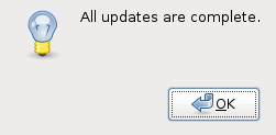
3.4.4. Information Alerts
Use an information alert when the user must know the information presented before continuing, or has specifically requested the information. Present less important information by other means such as a statusbar message.
- uses the stock information icon.
- presents a selectable message and an button. The button is placed in the bottom right corner of the alert. Pressing Enter or Escape dismisses the alert.
- may present a convenience button to give access to a relevant object. For example, a button in an appointment reminder alert that opens the appointment's property window. Place this button to the left of the affirmative button.
Roll-up/Unroll, Minimize (if the alert has no parent window), Close
3.4.5. Error Alerts
Display an error alert when a user-requested operation cannot be sucessfully completed. Present errors caused by operations not requested by the user by another means, unless the error could result in data loss or other serious problems. For example, an error encountered during an email check initiated by the user clicking a toolbar button should present an error alert. However, an error encountered in an automated periodic email check would more appropriately report failure with a statusbar message.
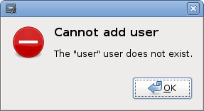
- uses the stock error icon.
- presents a selectable message and an button. The button is placed in the bottom-right corner of the alert. Pressing Enter may dismiss the error alert.
- may present a convenience button to allow immediate handling of the error. For example, a button in a "This disk is not formatted" alert. Place this button to the left of the affirmative button.
Roll-up/Unroll
3.4.6. Confirmation Alerts
Present a confirmation alert when the user's command may destroy their data, create a security risk, or take more than 30 seconds of user effort to recover from if it was selected in error.
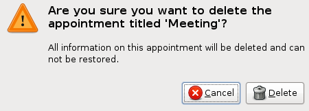
- uses the stock warning icon.
- presents a selectable message and a button labelled with a verb or verb phrase describing the action to be confirmed, or labelled OK if such a phrase would be longer than three words. This button is placed in the bottom right corner of the alert.
- presents a button that will prevent execution of the user's command. This button is placed to the immediate left of the or equivalent button.
- may present an alternate action button or a convenience button. Place this button to the left of the button.
Roll-up/Unroll
- 3.4.6.1. Save Confirmation Alerts
3.4.6.1. Save Confirmation Alerts
Save confirmation alerts help ensure that users do not lose document changes when they close applications. This makes closing applications a less dangerous operation.
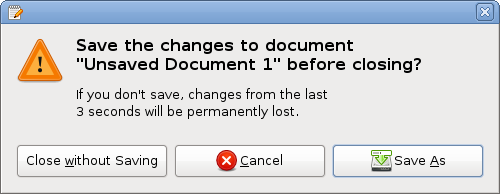
Save changes to document Document Name before closing?
You may replace “document” with a more appropriate description, for example “image” or “diagram” if the document in question is not primarily text.
If you close without saving, changes from the last Time Period will be discarded
The secondary text provides the user with some context about the number of changes that might be unsaved.
, ,
When a confirmation alert is needed, present it immediately. If the user confirms closing without saving, hide the alert and the document or application window immediately, before doing any necessary internal clean-up. If the user chooses to save before closing, hide the alert immediately but show the document window until the document is saved, in case an error occurs. Then hide the document window immediately after it has been saved successfuly.
3.4.7. Authentication Alerts
Authentication alerts prompt the user for information necessary to gain access to protected resources, such as their username or password. Authentication alerts are a special kind of alert because they are both routine and largely unavoidable. Every attempt should be made to retain information entered into an authentication alert as long as is possible within security constraints.
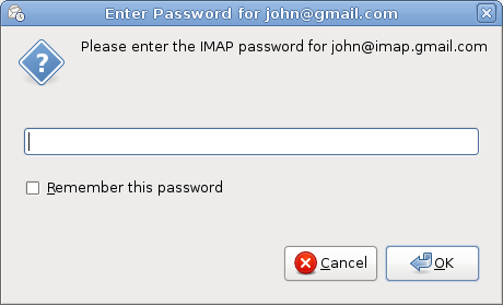
- Use the stock authentication icon.
- Show a labelled field for each required item of information. Suggested fields are Username and Password (in that order) where appropriate.
- If it is secure to retain the username longer than the password, pre-fill the username field and give focus to the password field when the alert is displayed.
- Show a button labelled with a verb or verb phrase describing the authentication action, or OK if there is no appropriate phrase or such a phrase would be longer than three words. Place this button in the bottom right corner of the alert.
- Do not enable the or equivalent button until all fields that require input have been attended to by the user. Remember that not all fields may require input however, for example an empty password may be acceptable in some applications.
- Show a button that will prevent authentication and close the alert. Place this button to the immediate left of the or equivalent button.
- Place any alternative action or convenience button to the left of the button.
- When the user presses Return in the last field, activate the default button. When the user presses Return in any other field, move focus to the next field.
Roll-up/Unroll