Window Layout
- 8.2.1. General
- 8.2.2. Dialogs
- 8.2.3. Spacing and Alignment
8.2.1. General
Placement of visual components in an application is important because relationships between elements are indicated by their positions. This is called "layout" in interface design.
A clean layout is crucial to creating a smooth visual flow of information for the user. This section describes the proper component placement and spacing to use in GNOME applications. The major components discussed will be labels, icons, radio buttons and check boxes, text fields, command buttons, and drop-down menus.
8.2.2. Dialogs
When a user is scanning a complex preferences dialog consisting of many labels and corresponding check boxes, text fields, and drop-down combination boxes, it is easy to see how she can quickly become hindered by poor layout in the visual design. For information on laying out Alerts, see Section 3.4.3 ― Spacing and Positioning Inside Alerts
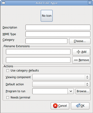
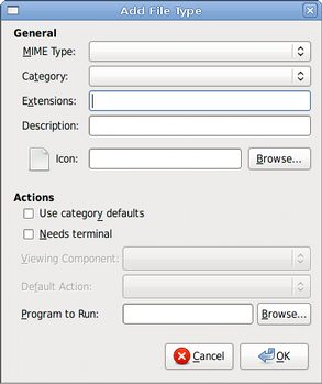
In Figure 8-3, the dialog on the left presents labels which are not left-aligned. The user's eye is not given a proper anchor to scan the dialog quickly.
As the labels are all similar in length, they should be left-aligned. Now the user has a firm left margin to anchor the eye and scan the list of items vertically more easily. If most of the labels in a group greatly differ in length, right-align them instead, so that the controls do not end up too far away from their corresponding labels.
Using frames with visible borders to separate groups within a window is deprecated. Use spacing and bold headers instead. This is more effective because there are fewer gratuitous lines to distract the user from the main content in the window. See Section 6.19 ― Frames and Separators for more details.
Try to keep components consonant with each other in terms of size and alignment. This is particularly important within a group of controls, so that the user's ability to quickly scan information is not sacrificed. Minimize as much as possible the need for the user's eye to jump around when scanning a layout.
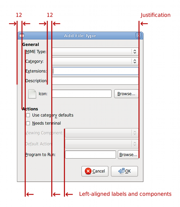
- Leave a 12-pixel border between the edge of the window and the nearest controls.
- Leave a 12-pixel horizontal gap between a control and its label. (The gap may be bigger for other controls in the same group, due to differences in the lengths of the labels.)
- Labels must be concise and make sense when taken out of context. Otherwise, users relying on screenreaders or similar assistive technologies will not always be able to immediately understand the relationship between a control and those surrounding it.
- Assign access keys to all editable controls. Ensure that using the access key focuses its associated control.
8.2.3. Spacing and Alignment
Provide adequate space between controls and groups of controls. This white space will make it easier for the user to find the information they need.
- As a basic rule of thumb, leave space between user interface components in increments of 6 pixels, going up as the relationship between related elements becomes more distant. For example, between icon labels and associated graphics within an icon, 6 pixels are adequate. Between labels and associated components, leave 12 horizontal pixels. For vertical spacing between groups of components, 18 pixels is adequate. A general padding of 12 pixels is recommended between the contents of a dialog window and the window borders.
- Break long lists of choices into smaller groups. For lists of less than about eight items, use radio buttons or check boxes. For longer lists, use a list control or drop-down list.
- Try to keep elements of the same type left-aligned with each other. For instance, in Figure 8-4, the group titles (General and Actions) are left-aligned and justified with each other.
- Indent group members 12 pixels to denote hierarchy and association.
- Minimize the number of alignment points in your window. An alignment point is an imaginary vertical or horizontal line through your window that touches the edge of one or more labels or controls in the window.
- Right-justification within groups or the overall window (as indicated by the line labelled "justification" in Figure 8-4 is pleasing to the eye, but not crucial.
- Lay out components left-to-right, top-to-bottom. Generally, the first element the user is meant to encounter should be in the top-left, and the last in the bottom right. Keep in mind that when localized for non-western locales, interfaces may be reversed so that they read from right to left.
- Using "white" or blank spacing and indentation to delineate groups is cleaner and preferable to using graphical separators such as frames.
- Align controls in your layout exactly. The eye is very sensitive to aligned and unaligned objects. If nothing lines up with anything else in a window, it will be very hard for the user to scan the contents and find the information he wants. Two things that almost line up, but not quite, are equally distracting.
- Be consistent. Use the same spacing, alignment, and component sizes in all dialogs appearing in your application. The and buttons, for example, should all appear exactly 12 vertical and horizontal pixels from the lower right corner of every dialog window.
- Ensure that light and dark areas as well as spacing are equally distributed around the window. Keep in mind that every control or group of controls in your window has a visual "weight," depending on its overall size, color, and how much white space it includes. Darker, larger areas are "heavier," while paler, smaller areas are "lighter."
- Do not design windows that are more than 50% longer in one dimension than in the other. People are more comfortable looking at windows and dialogs whose dimensions stay within the golden ratio (about 1.6 to 1), a ratio that artists and architects have used to create aesthetically-pleasing paintings and buildings for thousands of years.