Designing a Menu
- 4.3.1. Grouping Menu Items
- 4.3.2. Types of menu item
4.3.1. Grouping Menu Items
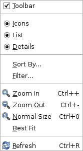
Menu separators are the horizontal dividing lines that visually separate groups of related items on a drop-down menu, submenu, or popup menu. For example, the separators in Figure 4-5 divide the menu into five functionally-related groups. Good use of separators helps to "chunk" the information on a menu and make it easier to scan and memorize.
- The best size for a group is around 2-5 items. Single-item groups are best placed at the top or bottom of a menu, otherwise try to group them with other single items of the same type on the same menu.
- Order items within a group logically, numerically, in task order or by expected frequency of use, as appropriate.
- Only place one type of menu item in each group— command, mutable, check box or radio button. For example, do not place commands (such as ) and settings (such as. ) in the same group.
4.3.2. Types of menu item
- 4.3.2.1. Command Items
- 4.3.2.2. Mutable Command Items
- 4.3.2.3. Checkbox Items
- 4.3.2.4. Radio Button Items
4.3.2.1. Command Items
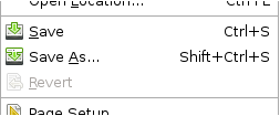
Command items are menu items that initiate a command or perform an action, such as , or . They may act on the currently active document in a document based application, or on the application itself.
- Provide a keyboard shortcut for standard or frequently used command items. See Section 10.2.3 ― Choosing Shortcut Keys for more information on choosing shortcut keys.
- Do not remove command items from the menu when they are unavailable, make them insensitive instead. This allows the user to infer what functionality the application provides even if it is not currently available, and keeping the menu structure static makes it easier to memorize.
- Label the menu item with a trailing ellipsis ("...") only if the command requires further input from the user before it can be performed. Do not add an ellipsis to items that only present a confirmation dialog (such as ), or that do not require further input (such as , or ).
4.3.2.2. Mutable Command Items
A mutable command item changes its label when selected. For example, in a browser may change to to allow the user to interrupt the operation if it is taking a long time.
Note that mutable menu items can be problematic because the user never sees the menu item changing, so it is not obvious that a different function has become available.
- If your mutable menu items are command items, and you have sufficient space on your menu, consider providing two adjacent menu items for the commands instead. Then make the items sensitive or insensitive as the situation demands. This also makes it easier for the user to tell when different shortcuts are available for each of the commands, for example Ctrl+R for , and Esc for .
- Do not use mutable menu items to toggle a two-state setting (for example, and ). Present such items as a single check box item instead.
4.3.2.3. Checkbox Items
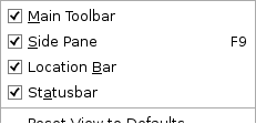
A check box menu item shows the current state of a two-state setting, and allows the user to toggle it by selecting the menu item.
- Use a check box menu item only when it is obvious from the label what the set and unset states mean. This usually means that the two states are logical or natural opposites, such as "on" and "off". If this is not the case, use two radio button items instead.
- Never change the label of a check box menu item in response to the user selecting the item.
4.3.2.4. Radio Button Items
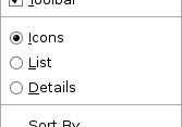
Radio button menu items show which of two or more mutually-exclusive settings are currently selected, and allow the user to choose a different setting by selecting its menu item.
- If you need to offer a choice of two mutually-exclusive settings to the user, use a group of two radio button items instead of a single check box menu item if the settings are not clearly opposites. For example, represent and as two radio button items.
- Never change the label of a radio button menu item in response to the user selecting or deselecting the item.